The main issue is that the electronics in today’s digital cameras record many thousands of discrete brightness levels. A 16-bit camera records 65,536 brightness levels. However, software maps this range of values into the 256 (8-bit) grayscales that computer monitors display. From the original data, a screen displays a white point, black point, and the translated grayscales in between.
No single correct choice for this screen stretch (or scaling) exists, but when you save this image, you’re committed — there’s no going back. The key is to make certain all of the important features in the luminance are mid-gray in value so that the color will blend in easily.
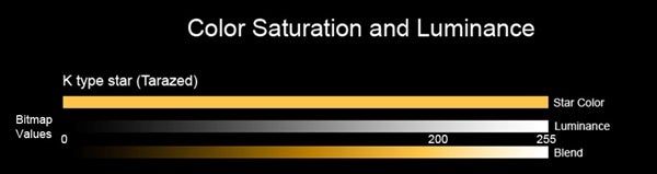
Note that as you go from left to right along the blended line, the color eventually fades and at the far right is nearly white. This is true for any color, which means that an overly bright luminance image will not have good color contrast.
If the grayscale line represents values from 0 to 255, at what value does the color start to significantly fade? Conservatively, the last fifth of the bar looks quite faded. So, grayscales that are approximately 200 or greater are in the “danger zone” of being challenging to colorize.
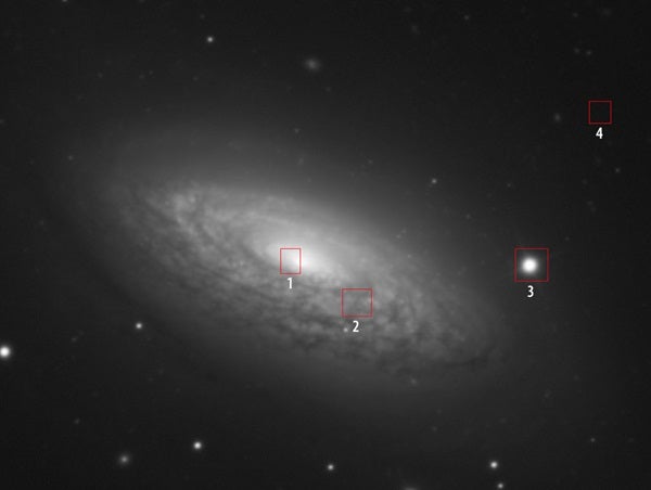
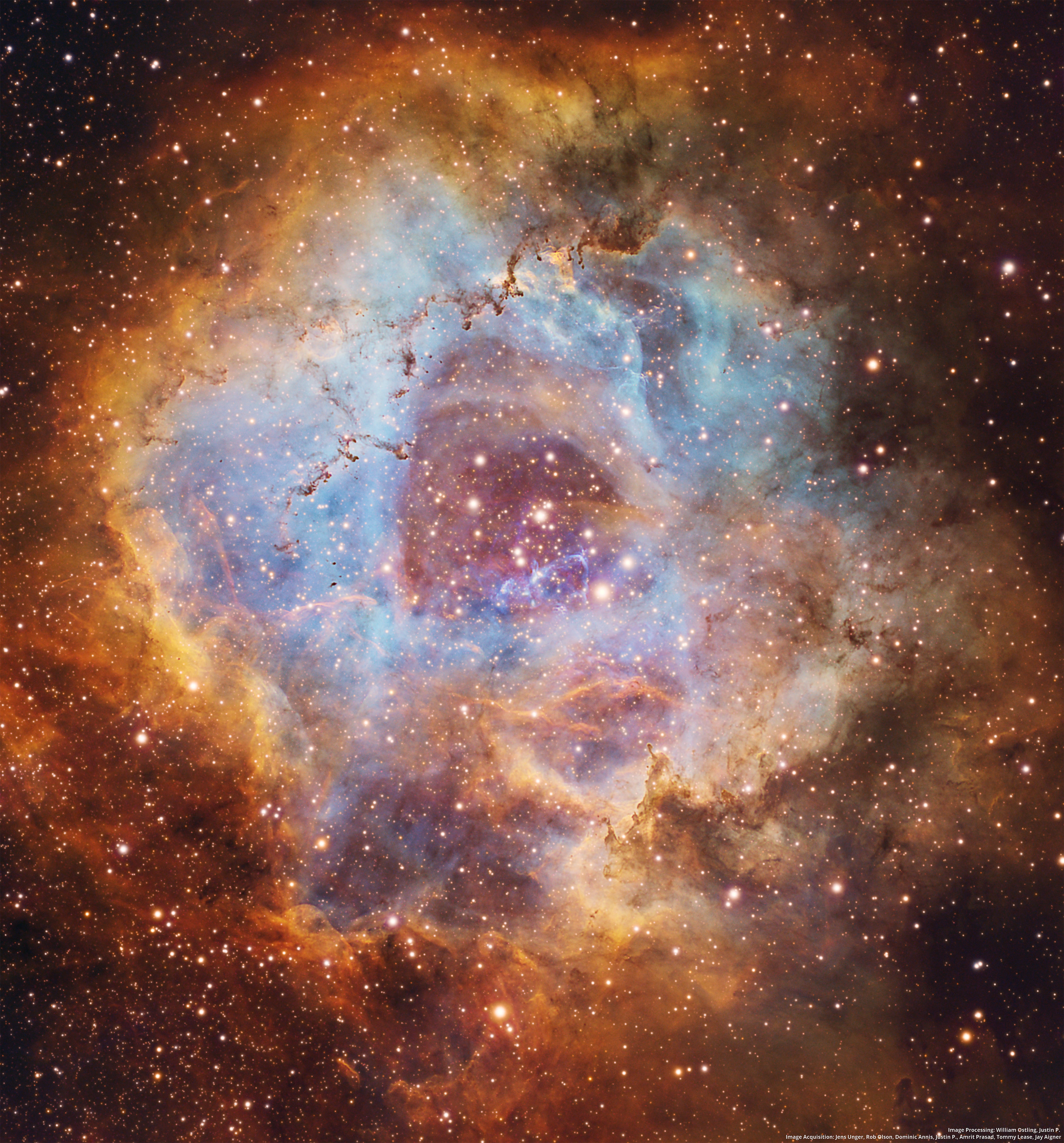
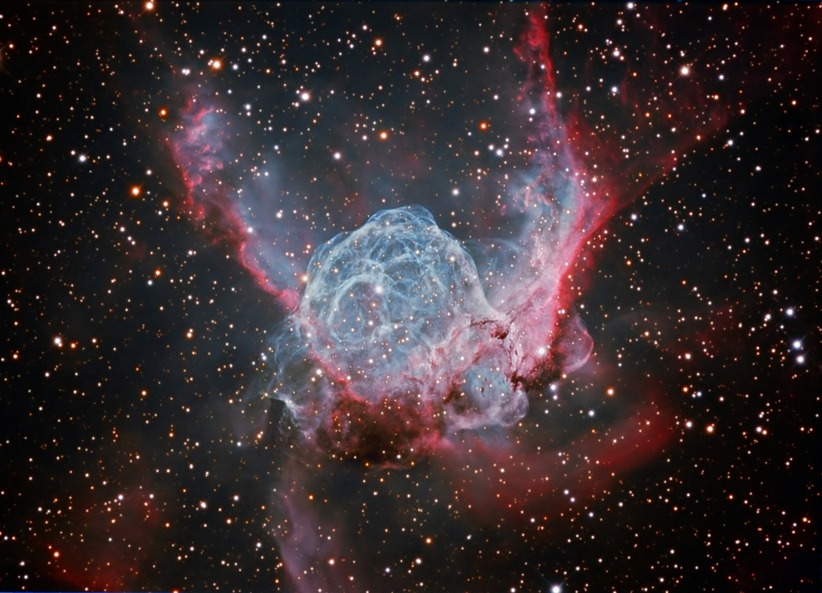
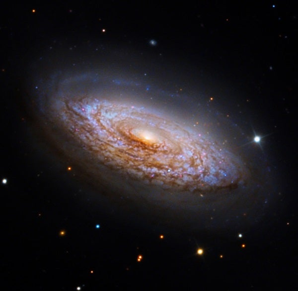
Neither bright stars nor the stellar nucleus of the galaxy should be the metric for determining how bright to make the image. Instead, you will want to monitor the galaxy’s features in bright areas like the core, spiral arms, and nebulae.
I brighten my luminance image in CCDStack because it reports the bitmap grayscale values, and I can use the real-time adjustment while I measure the image. You also can accomplish this feat in any image-processing software as well as in Photoshop using the eyedropper tool with “Curves.” Doing so will determine the white point for your image.
Finally, if you brightened the image outside Photoshop in another program, you need to save your image with these new permanent screen stretch values. Image-processing programs have different language for this, including “Auto-Stretch” and “Create Scaled Image.”
Save the image as a TIFF file, and you can then open it in Photoshop with the confidence that once you brighten your color layer, the luminance image will respond accordingly. Taken together, they will color the scene realistically and just as you imagined.