Key Takeaways:
Let me begin by saying what an honor it is to author a column in Astronomy on image processing. I have been reading this magazine my entire life, and to be part of the burgeoning community of digital astrophotographers through it is incredible. I also bow to my predecessor, Tony Hallas, for blazing a trail and writing a concise column on the subject, which will serve as a template for my future articles.
Image processing is a mix of both science and art. The science comes from the fact that each picture we take is a measurement. Handling the values we obtain in a rigorous way through standard processing steps enables us to get the most from our data. The art comes from the choices we make about which attributes of the data we want to highlight.
I considered addressing my overall processing philosophy first, but space is limited. Instead, I’ll highlight a few critical themes I will revisit in future articles.

First, most processing steps are small and incremental, but you will see their cumulative effects in your final images. For this reason, I’ll always provide Internet links to the objects I discuss. Due to the vagaries of the printing process, the view on your monitor may better represent the effects I describe here.
Second, I generally choose global adjustments whenever possible. They are easier (and faster) to do, and they help avoid unintended artifacts.
Finally, my style is what many would call “naturalistic,” and I’ll add that it’s also slightly conservative. I value maintaining certain truths about the target in terms of brightness, color, and detail. For example, galaxies are almost always brighter in their centers, so I choose to display them this way even if it means the inner structure doesn’t show up as well.

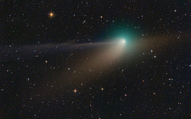
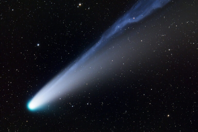
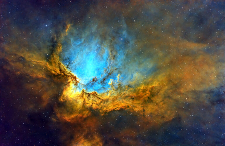
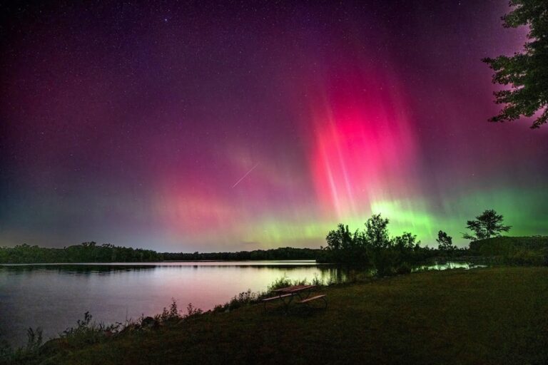
With this in mind, I offer an artistic processing trick. Certain objects contain wispy and faint structures. The tidal tails of galaxies as well as the galactic cirrus in our home galaxy are the kinds of challenging details that add impact to an image. At some point, that image is as bright as it can be (based on the quality of the data) without showing the deleterious effects of noise and imaging errors.
So, you have those wisps, and if you could just make them stand out a bit more, you would be happy with the picture. To increase the contrast, you must either brighten the image, which would reveal noise, or make the sky darker and potentially lose the detail you are striving to retain! What to do?
Using Photoshop, make two copies of your color image as two more layers. I labeled them in the screen shot for clarity. On the bottom layer, apply the “Equalize” effect (under “Image” and “Adjustments”). Blend the middle layer with the bottom layer using the “Multiply” blending mode. Finally, on the top layer change the “Opacity” to reveal this multiplicative contrast effect, or MCE, my name for this tool.

Here’s how it works. The “Equalized” version of your image displays everything that is even the slightest brightness above the sky value as nearly white. Don’t worry about the colors you may see. (This tool is also wonderful at showing all of your flat field errors and other gradients.) This crazy image is now something like a map. Anything bright in the image will remain visible when blended with “Multiply.” Your wispy clouds and tidal tails will remain at their original brightness level, while the sky will become darker. This is a simplified version of a threshold mask that I’ll explain in a future article.
When you blend with “Multiply,” you get a single result. Use the original image to let this effect come through by changing the “Opacity.” Applying this tool modestly to objects with faint structures can make those features stand out without your applying arbitrary selective techniques by hand. In the case of NGC 520, the tidal tail reaches out to the nearby companion galaxy UGC 957, and with NGC 7497, the dusty galactic cirrus billows with high contrast.