British astronomer Admiral William Henry Smyth may have been a pioneer in applying color science to astronomy. His 1844 Cycle of Celestial Objects is filled with colorful descriptions of double and multiple stars — including smalt blue, flushed white, orpiment yellow, dusky orange, and cherry red. While most of the star colors he perceived (sans adjectives) were among those considered most distinct to visual astronomers (blue, yellow, orange, and red), Smyth also saw among the stars his share of violet — a color beyond the blue end of the spectrum. But the reason he saw them may be more than just simple physics.
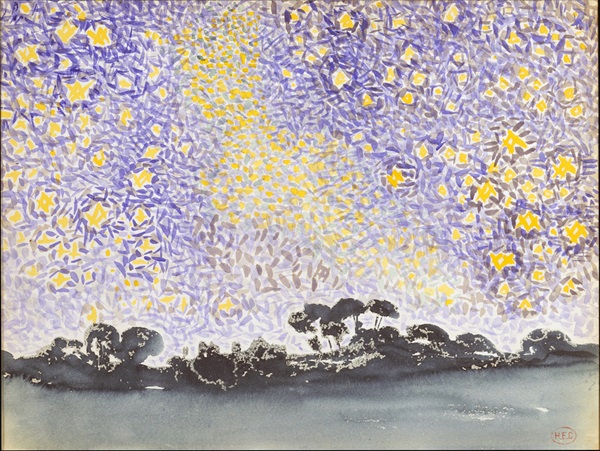
Violet is a color hard to find not only in nature but also, historically, in art. That’s the conclusion reached by Russian American artist and cognitive scientist Allen Tager, who, over the course of 20 years, visited 193 museums in 42 countries and examined nearly 140,000 works of art to see how many incorporated the color violet. As he wrote in a June 23 article for Psyche, Tager found very few paintings using violet before the 1860s, when the French Impressionists adopted the color in earnest.
To investigate further, Tager teamed up with color scientists Eric Kirchner of the paints company AkzoNobel and Elena Fedorovskaya at the Rochester Institute of Technology. They used computer algorithms to analyze more than 4,000 digitized works of art. In a paper published March 13 in the journal Color Research & Application, they reported that prior to the mid-19th century, violet appeared in fewer than 4 percent of paintings. But this rate quickly rose to 37 percent in the second half of the 19th century and spiked to 48 percent in the 20th century.
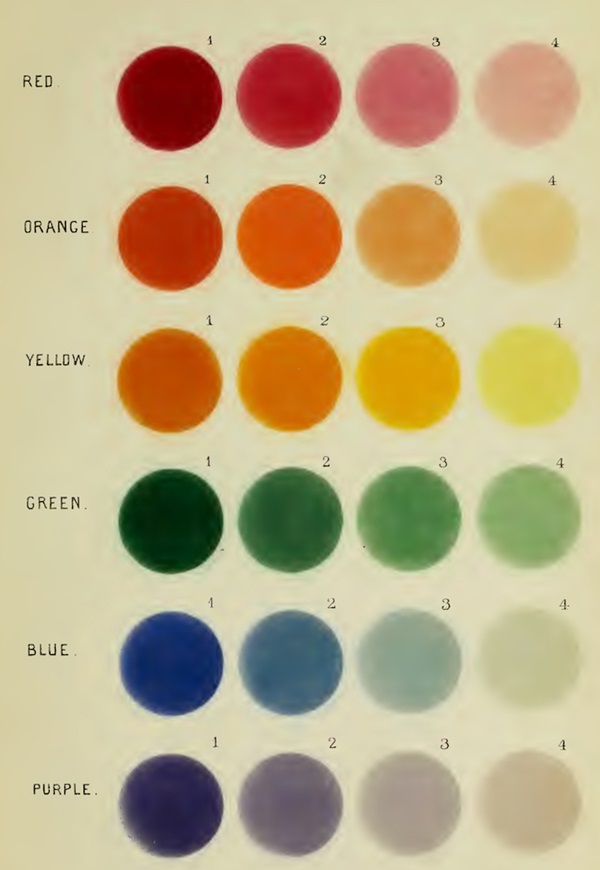
The researchers also discovered discrepancies over what constitutes the color violet. For instance, the color beyond blue on the spectrum is called purple in the U.S., but violet in the U.K.; alternatively, reddish-purple is sometimes called violet in the U.S., but hardly ever so in the U.K. This led Tager and his colleagues to create the first working definition for the color violet: “all mixtures of red and blue for which blue dominates.”
Introducing violet
In his 1864 book Sidereal Chromatics (On the Colours of Multiple Stars), Smyth recognizes an evolution not just in art but also in the color perception of skywatchers. “The ancients recognised no blue stars,” he says. “They only spoke of white or red ones.” Blue stars, he notes, were not introduced into the astronomical lexicon until French physicist Edme Mariotte first mentioned them in 1686. Smyth also notes that “although single red stars are frequently met with, there is not an instance of a solitary green, purple, blue, or violet-coloured one being found.”
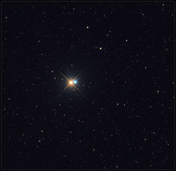
However, Smyth did note the appearance of violet in double stars. In fact, he appears to be the first telescopic observer to use the color violet in his descriptions of stars. For instance, as early as the 1830s, he recorded numerous double stars with white or yellow primaries and a violet secondary. To my knowledge, all observers before him stuck to the traditional color schemes in their descriptions of double stars. Observers following Smyth, however, began incorporating violet into their double star vocabulary, albeit sparingly.
Inspired by science
In their March 2021 paper, Tager and his colleagues describe how contemporary developments in color theory and their adoption by Impressionist painters may naturally have led to an increase in the use of violet from 1863 onwards.
Interestingly, in the early years of the Impressionist movement, we see Smyth promoting in his Sidereal Chromatics “the laws of harmonious alliance and contrast of colour — that yellow is of all hues the nearest related to light, and its complementary violet or purple to darkness.” The above quote seems to indicate that Smyth was familiar with Goethe’s analysis of the sensory and psychological effects induced by different colors, which he published in his 1810 work Theory of Colors.
Smyth then goes on to say, “Many of the observed tints of stellar companions would of course turn out to be merely complementary [colors] and caused by the law of simultaneous contrast.” This concept, introduced by French chemist Michel Eugène Chevreul (and inspired by Goethe) in his 1839 The Principles of Harmony and Contrast of Colours, blossomed around the time that Smyth was making his color observations, some 25 years before he published Sidereal Chromatics.
Chevreul’s law stated that when two adjacent colors are observed, their perceived colors shift toward the complementary color of the adjacent color. For a binary star that contains a bright, slightly orange-yellow star next to a white star, Chevreul’s law predicts that the human eye will see the color of that white star shifted toward violet. That’s because violet is the complementary color to yellow, as they are opposing hues on a color wheel. These inferences suggest that science theory had begun to make its mark on visual telescopic observations by the mid-19th century.
And it was this type of optical effect (simultaneous contrast for colors) that the Impressionists sought to capture and exploit in their works. This allowed them to create even stronger color contrasts — a canvas bristling with scientific proof that what the eye perceived and the brain understood were two different things. “Impressionist painters used the colour violet so prolifically,” Tager wrote for Psyche, “that critics accused them of violettomania.”
While the range of colors of stars are limited to hues that vary from reddish orange to pale blue, what our eye-brain system sees depends on many factors. These include atmospheric clarity, the telescope used, contrast, and bias (from knowledge of a star’s spectral class and color temperature), among others. But don’t let that stop you from recording what you see rather than what you are expected to see.
And as always, report what you see or don’t see to sjomeara31@gmail.com.

