colorful-connectionshttps://www.astronomy.com/observing/colorful-connections/Colorful connections | Astronomy.comAstroimager Adam Block demonstrates how to use Photoshop to create more colorful — but still accurate — celestial photos.https://www.astronomy.com/uploads/2021/09/AdamBlock_2013.jpgInStockUSD1.001.00astrophotographyarticleASY2023-05-182014-06-2347506
Astroimager Adam Block demonstrates how to use Photoshop to create more colorful — but still accurate — celestial photos.
By Adam Block |
Published: June 23, 2014 | Last updated on May 18, 2023
Beginning astroimagers want results, and that means colorful images. Unfortunately, that doesn’t happen quickly. So, this column is about the foundations of blending color.
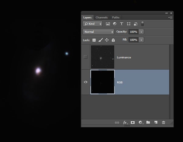
The best way to create a colorful image is by working on a color layer that is independent of a “properly prepared” luminance layer, which I’ll discuss in a future column. The color layer is not scaled or stretched and opens looking dark in Photoshop (image #1). Paste the luminance layer above the color layer so that the conversion from a grayscale image to an RGB image happens automatically. Blend the luminance layer with the color layer using the “Luminosity” mode.
1. The author first opened the color image in Adobe Photoshop as a TIFF file that he had not stretched or brightened in any way. The arrow points to the galaxy in the image.
All images: Adam Block
You must brighten the color layer to make its values commensurate with the luminance layer. Ultimately, you monitor the interaction between the two layers to see how the color is blending at the various brightness levels. The initial steps of brightening the color layer, however, ignore its luminance companion entirely.
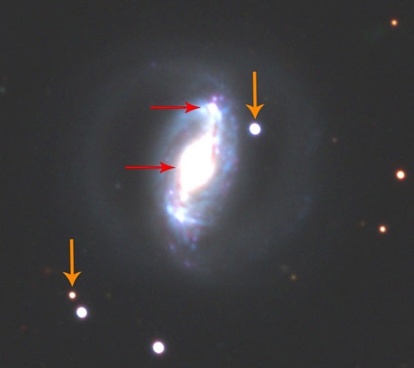
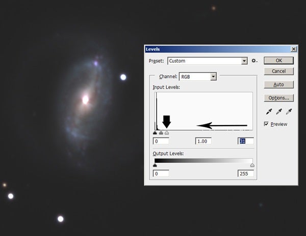
The first rule for the color layer is that features that are “clipped” (so bright that detail is lost) are not useful (image #2). I worry only about clipping in features of interest. So, brighten the color layer by adjusting the white point in “Levels” to just before the vertical line hits the top (image #3).
2. Clipping happens when regions of an image take on a single color or become completely white (noted by arrows). You can clip bright stars as long as you don’t also clip features in the main object.
After doing this, you still can brighten the color layer using nonlinear adjustments. Typically, imagers make a small adjustment using “Curves.” When you brighten a color image this way, dim and bright RGB values become more similar to one another, which tends to decrease the overall color saturation of the image. So, you must re-raise the color saturation a little to bring it back to its previous vibrancy.
3. The author properly brightened this image using “Levels.” He will not touch this setting again.
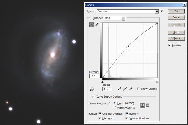
The adjustment in “Curves” is a simple one: Pull from the center of the line to form a shallow bow shape (image #4). Now unhide the upper luminance layer, and you’ll see some pale color. Although more applications of “Curves” and color saturation can achieve reasonable results, I’ve found that Photoshop’s “Shadows/Highlights” tool is an easier and more powerful way to do this.
4. The simplest way to brighten an image using “Curves” is to pull the line from the center point and form a shallow bow shape. Remember to readjust the color saturation in your image after doing this.
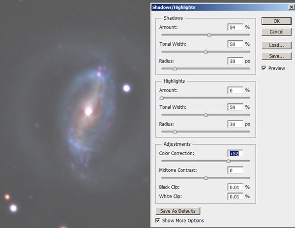
The “Shadows” section of this tool is all you need. Set the “Highlights” “Amount” to 0 and the “Shadows” “Amount” to 50 percent. This will brighten the bottom third of the brightness values in your image, which is generally where the interesting features are. Brighter values will remain nearly unchanged. “Shadows/Highlights” also comes with a “Color Correction” in the “Adjustments” section that re-raises the saturation. I generally set this to between 50 and 60 percent (image #5).
5. This screen shot shows the settings for the “Shadows” of the “Shadows/Highlights” tool. Experiment with them to get the best result. Note that the author sets the “Amount” within the “Highlights” section to 0.
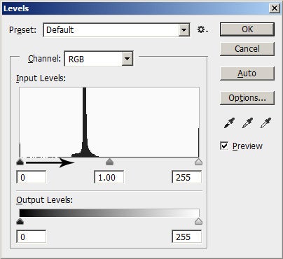
Finally, the color layer’s contrast is what ultimately controls the color in your blended result. At the start, you adjusted the white point just before clipping occurred. Without adjusting this, how do you change the contrast? Raise the black level (image #6) of the color layer.
6. Apply the “Shadows/Highlights” process, and then raise the black point in “Levels” to increase color in your image by sliding the house-shaped icon to the right. Do not touch the white point setting on the right.
Slide the house-shaped icon in the direction of the black arrow. This will increase the image’s contrast and bring more vibrancy to the picture. I always blend my color layer at 100 percent without sacrificing any detail in the luminance layer.
I have been using this simple method to color images since Adobe introduced the “Shadows/Highlights” tool in 2003. I think if you give it a try, you will find new freedom to adjust your images and colorize the universe as you see it.